To create our artist website we used Wix. I enjoyed learning how to use Wix as I had never done anything (apart from blogging) like making a website before.
 |
| The tool bar |
 |
| Our Pages Breakdown |
In Wix we used tool bar on the right to create our website.
- Top button = Background
- Add = different elements such as text, images, store, slideshow
- Wix App Market = from where we added the Wix Music App
- My uploads = such as our photo-shopped promo shots
- Blog manager = which we used as the format of our news page
- Store manager = where we worked on our GiGi merchandise
Above left is a breakdown of the different pages of our website and their subsections. The eye emoticon illustrates that pages are hidden. For example, the Terms and Conditions page is linked to the Home page but it hidden until someone clicks on the link to it.
The image below illustrates some of the early work we did on the home page:
 |
| Early work and breakdown of reasoning |
From talking to a member of our target audience they said that our contact page looked a bit simplistic, therefore we adapted was the page to make it more informative. One of the changes we made was having Google maps to show where our record company is based. We also changed the font type and colour to match with the other website pages.
 |
| Our original contact page |
 |
| Our improved contact page |
Another part of the website we developed and improved was the gallery. To begin with we only had behind the scene photos which can be seen below:
 |
| Our original behind the scenes photos style |
After completing our promo shots and other photo shoots we were able to add more sub sections to the gallery which are now:
- Sit Still, Look Pretty: Behind the scenes
- Official Photoshoot
- Social Media
 |
| Our sub section gallery |
We also changed the behind the scenes photos from being in a carousel (as seen above) to making them look like Polaroids and also allowed us to see the captions of the pictures (seen below):
 |
| The new Polaroid style behind the scenes photos |
Another element of the website which we worked on was the tour page. This is arguably the most important part of an artist's website as it is where the most revenue is made and is one of the main purchasing opportunities. Therefore we worked on making it clear and precise so as to make it easily accessible for our audience. Below is an image of our tour page containing our photo-shopped tour poster and tour dates:
 |
| Our tour page |
In order to make our website seem genuine and informative we added Google maps, directions, parking information and the ability to buy tickets direct from the website using Pay-Pal.
 |
| Tickets for the O2 page |
A vital part of our artist website that increases audience enjoyment and allows an audience to learn more about GiGi is the Bio page which can be seen below:
 |
| Our Bio Page |
I really enjoyed writing and answering the questions as GiGi to allow an audience to further understand what she is like, which we have established in our music video. I photo-shopped the promo shots for this page and the use of a scroll bar of pictures allows for more audience interaction.
A key way to create fun and enjoyment for an audience on an artist website is to have something such as a quiz which allows for audience interaction. We took inspiration by Little Mix's quiz on their website and created our own:
 |
| Little Mix's quiz |
 |
| The bottom of the Bio page with the entrance to the quiz and the opportunity to subscribe |
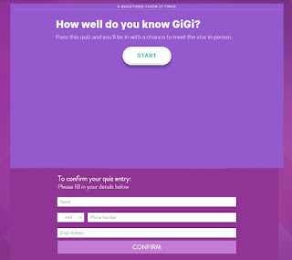 |
| Our quiz with the chance to win a meet and greet with GiGi |
Another way for our audience to keep up to date with GiGi is the use of blog posts on the News Page. By having a snapshot and the opportunity to "read more" it does not bombard the audience with too much information and lets them chose what they want to look at.
 |
| Our News page |
A Significant Change
Towards the end of the production period and after some target audience and teacher feedback about the background being a bit overpowering, we decided to change the background and included pictures of GiGi on most of the pages:
 |
| The new layout |
Key reference points were the websites of Carly Rae Jepsen, Selena Gomez and Dua Lipa.
 |
| Existing artist websites = reference points |
An addition to our Bio page was baby pictures of GiGi inspired by Taylor Swift's website which has a section of home videos.
 |
| Taylor Swift's Hone Video part of her website |
Target Audience Feedback
During construction of the website I spoke to Biri and she gave me some feedback which can be seen below:
- Liked how the footer looked realistic and that it could convince someone into thinking it was an actual website
- Clear purple and white colour theme
- Liked all the details of items in the shop and how the basket linked to Pay-Pal (and small details like the "No Animal Testing" in the description of the perfume)
- Liked how you could actually 'buy' tickets
- Loved the quiz and commented on how it was good audience interaction
- Can't go back a step you have to go back through the different pages in the gallery to get to where you were - so we added back to the gallery buttons
Also during construction I got feedback from our secondary target audience which can be seen below:
 |
| Secondary target audience feedback |
I spoke to a member of our tertiary audience to see what she thought of our website:
Tertiary Target Audience Feedback:
- Commented that maybe it was because of her age, but she was totally convinced as to the authenticity of the website
- Liked the clear landing page- the fact that the video is hidden behind the GiGi logo encourages people to want to go into the website
- Loves the homepage scroll bar as it is very eye-catching and also all the homepage gadgets
- Thought that the quiz was amazing
- Recognised the synergy of the GiGi logo and tour picture on all the merchandise
- Did actually try to buy tickets
- Liked the baby photos as it gave the bio page a human touch
- Ease at which you can move around the website, especially the gallery, as it is important for an older audience who don't want to be challenged by technology
- Felt that the use of recognisable logos such as PayPal, Twitter and Facebook gave the whole website it's air of total authenticity
Teacher feedback has also been very useful in our creation of our artist website. For example, they suggested that we changed our original background that was overpowering.
Overall, I am very pleased with our artist website as we have followed website conventions as well as using our ideas and imagination to create a unique, eye-catching website that appeals to and gratifies our audience.


No comments:
Post a Comment